Image - 2026-05-21 20:11
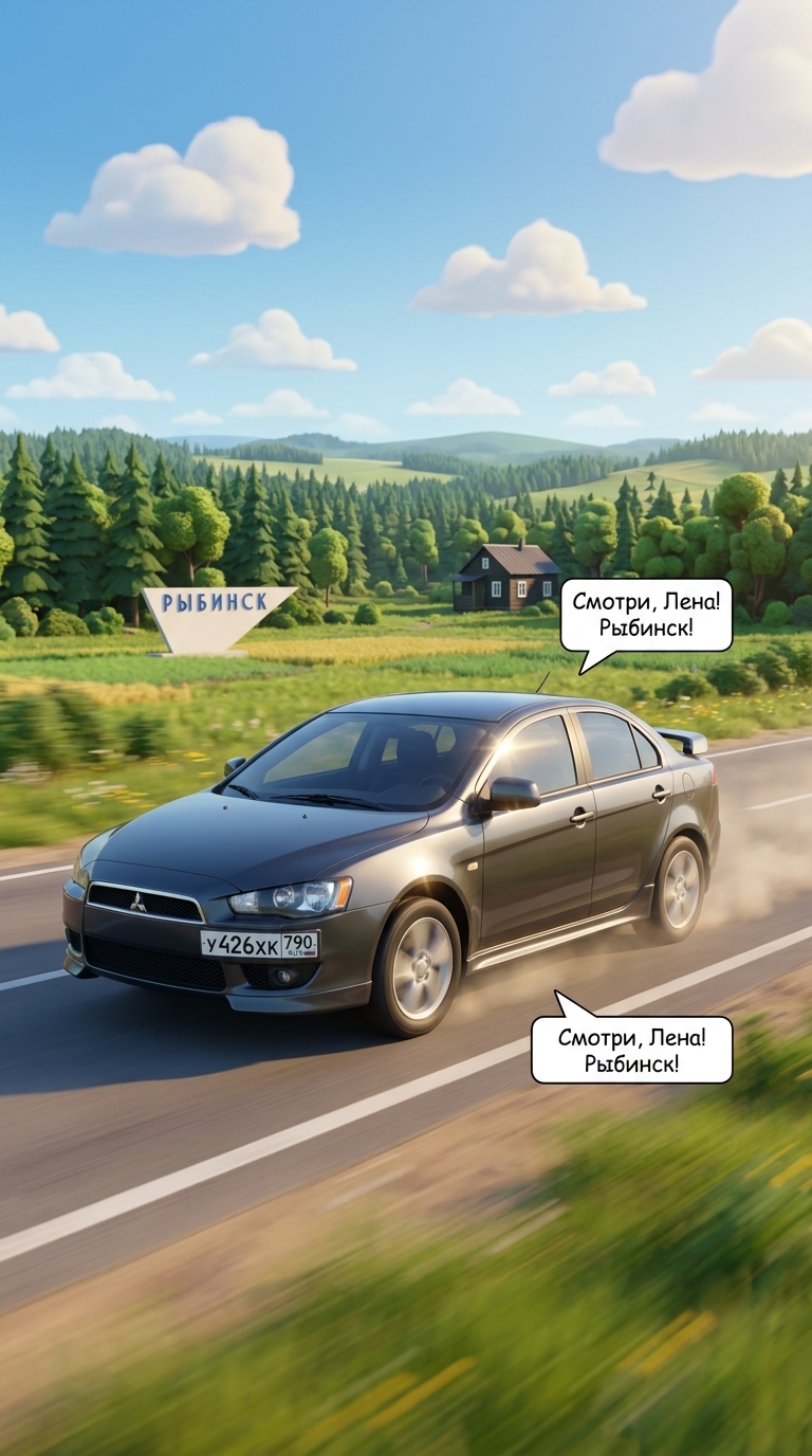
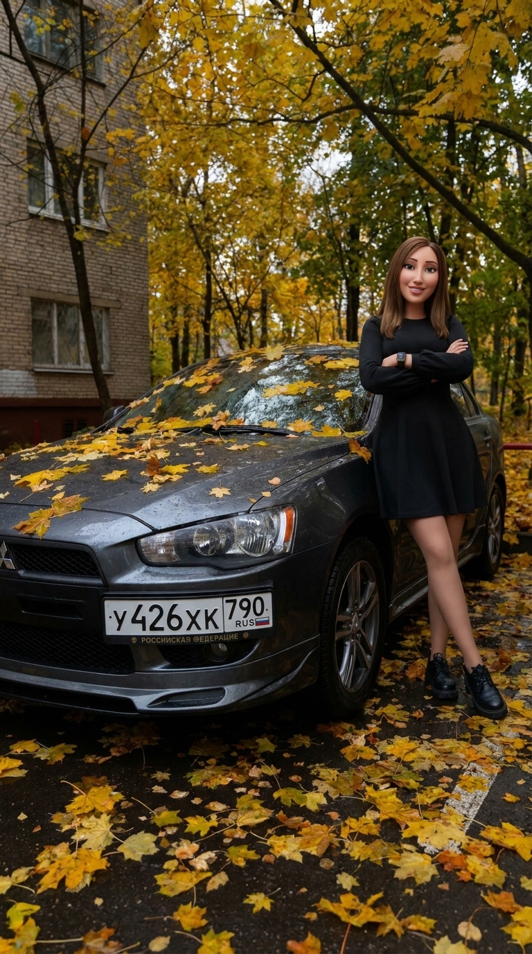
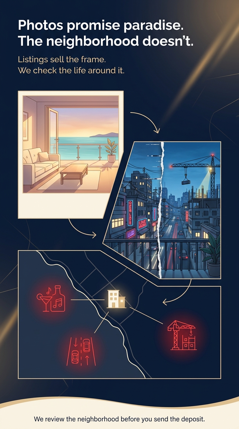
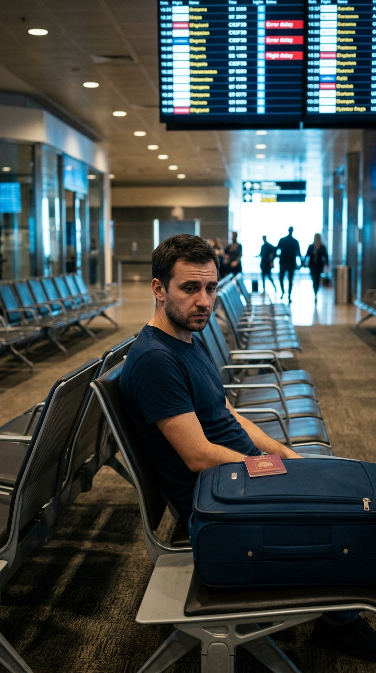
Create a highly detailed vertical comic-style editorial card, 1080x1920 pixels, for a premium relocation concierge service in Thailand. The design should look like a single, sophisticated story panel rather than a simple poster. Overall mood: trustworthy, premium, service-focused. Main color palette: deep navy background, warm cream panels, subtle warm gold light, sharp red accents. No people, no faces, no logos, no UI screenshots. Place all key content and typography inside a central “safe” area of 1080x1350, so the image works both as a story and as a feed cover. Keep plenty of breathing room and a clean modular layout. Top section: a strong headline in bold, clean sans-serif, left-aligned, in English. Text: “Photos promise paradise. The neighborhood doesn’t.” Below it, a smaller subheading in cream or soft white: “Listings sell the frame. We check the life around it.” Typography should feel like a premium service brand, not a cheap flyer: large line spacing, clear hierarchy, no decorative fonts. Main comic area below the text is divided into three connected visual zones that tell one story. Zone 1 (Expectation — the listing): on the upper left, draw a large rectangular “photo” frame of a perfect seaside apartment. Interior is bright and minimalist: clean sofa, simple table, open balcony door, warm golden evening light, a calm strip of ocean visible on the horizon. This block should feel soft, dreamy and almost too perfect. Add a thin cream border around this frame to separate it from the background. Zone 2 (Reality — the view from the balcony): to the right and slightly lower, show the same balcony view in reality. Instead of ocean, we now see dense urban rooftops, neon bar signs, a busy road with car headlights, power lines and a partially visible construction crane with lit floors. Use cooler tones and stronger contrast here: more deep blues, greys and neon reds. Between the “perfect photo” block and the “reality” block, add a clear visual break: a vertical cracked line, glitch effect or torn-paper edge, as if the ideal image has been ripped open to reveal what was hidden behind it. Zone 3 (Hidden risks on the map): in the lower part of the safe area, draw a minimalist overhead map of a coastal neighborhood, in a premium service infographic style. No real street names, only simple shapes and icons. Show a cream-colored residential building icon near the shoreline. Around it, mark three red line-art icons: a bar symbol, a busy main road symbol, and a construction crane symbol. Soft red glow around each icon indicates “risk spots”. Connect each icon back to the building with thin cream lines, so it’s obvious these problems are right next to the apartment. The map should stay clean and elegant, not cluttered. Connect the three zones visually so the viewer’s eye travels from top-left (beautiful listing photo) to mid-right (noisy reality from the balcony) and then down to the map (clear explanation of the hidden risks). Use subtle arrows, angled panel borders or thin guiding lines, but keep everything minimal and premium. Bottom of the card: add a soft cream wave-shaped separator in the brand style across the full width. Above this wave, in small, calm sans-serif, add one service line in English: “We review the neighborhood before you send the deposit.” Keep this line understated and secondary to the main headline. Overall style: premium editorial comic, combining flat illustration, light line-art and service infographic design. No humans, no faces, no emojis, no app screenshots. Focus on interiors, streets, neon signs, roads and the map. The image should feel like a smart, quiet warning from a high-end concierge service, not a loud ad.
Free to start · Generate videos and images with AI in seconds
More from this creator

More L images
См. все →