Image - 2026-05-27 14:12
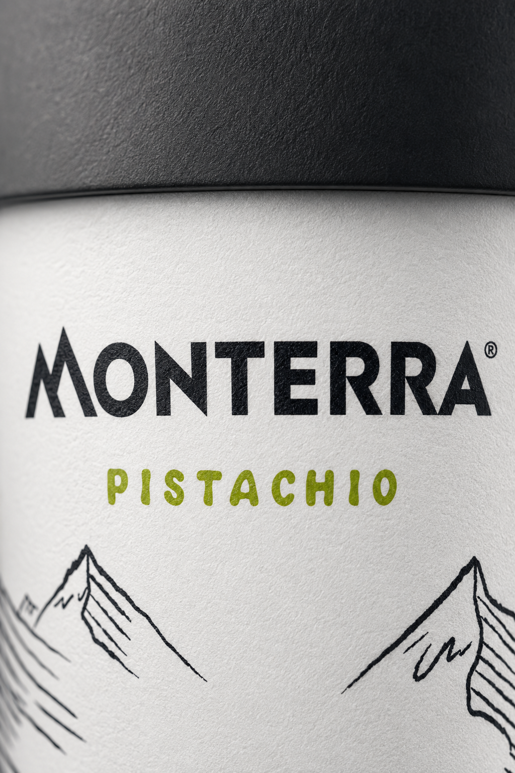
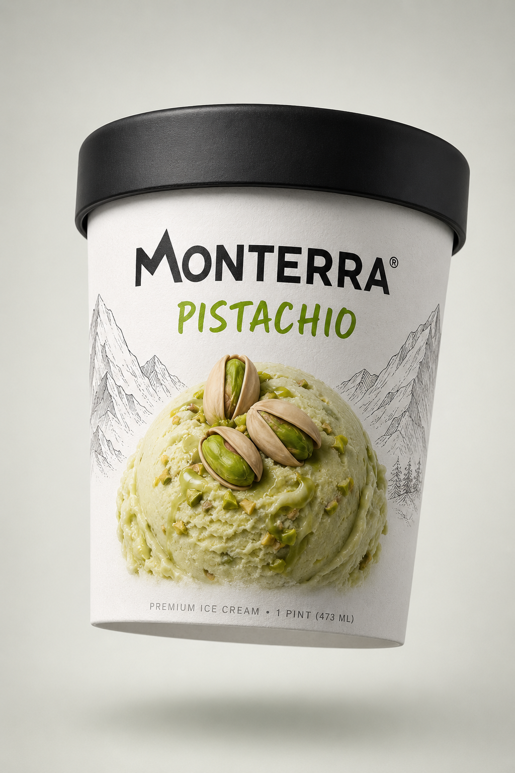
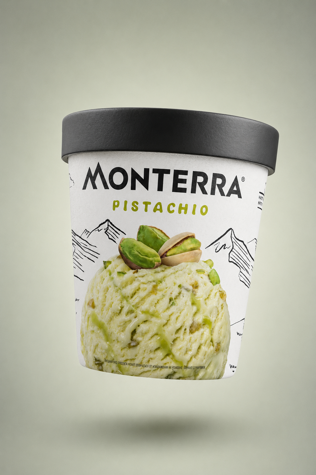
@img-1 Ultra-macro studio shot of the MONTERRA Pistachio ice cream pint label fragment from reference image @img-1. Extreme close-up focused on the upper logo and flavor text area of the white cylindrical paper packaging body, just below the matte black lid. ═══════════════════════════════════════════ FRAMING: ═══════════════════════════════════════════ The entire "MONTERRA" wordmark with its small ® symbol AND the full "PISTACHIO" flavor text below fit completely inside the frame — nothing cropped, nothing cut off. Small breathing space around the typography. A hint of the matte black lid visible at the very top edge of the frame, and a hint of the hand-drawn black mountain line illustrations at the lower edges of the frame for context. Subtle curvature of the cylindrical pint visible through soft perspective. ═══════════════════════════════════════════ ABSOLUTE TEXT & LOGO PRESERVATION: ═══════════════════════════════════════════ Pixel-perfect preservation of the original MONTERRA brand identity exactly as shown in @img-1: • "MONTERRA" — bold black uppercase sans-serif wordmark, with the distinctive triangular mountain-peak shape integrated into the letter "M" (the M has a sharp pointed apex that looks like a mountain summit). Small ® registered trademark symbol on the upper-right of the final "A". Keep exact kerning, exact letter proportions, exact stroke weight. • "PISTACHIO" — written in a playful pistachio-green handwritten/brush-style font, centered directly below the MONTERRA logo, Latin alphabet, exact spelling P-I-S-T-A-C-H-I-O, lowercase-friendly casual feel but as shown in reference. NO distortion, NO redrawing, NO invented letters, NO letter substitution, NO Cyrillic where Latin should be, NO altered spelling, NO extra characters, NO missing characters. Latin stays Latin. Every letter must match @img-1 exactly. ═══════════════════════════════════════════ SURFACE & MATERIAL DETAIL: ═══════════════════════════════════════════ Maximum surface detail of the premium matte white paper/cardboard packaging — visible paper micro-fiber texture, subtle uncoated paper grain, delicate cold-press feel. The black MONTERRA letters show fine ink printing relief with the tiniest ink edge sharpness and a soft matte finish. The green PISTACHIO text has a slightly fresher, brighter ink density with delicate brush-stroke texture visible at extreme magnification. Subtle natural micro-reflections of cool studio light on the paper surface. Just a hair of the matte black plastic lid texture visible at the top — soft rubbery matte finish with delicate light fall-off. ═══════════════════════════════════════════ LIGHTING: ═══════════════════════════════════════════ Soft cinematic side light from the left, raking gently across the label surface to emphasize typography relief, paper grain depth, and the subtle curvature of the cylindrical pint. No blown highlights on the white paper, no harsh black crush on the black letters. Beautiful even exposure with rich midtones. Cool neutral white balance with a faint pistachio-green ambient bounce light to enhance the flavor identity. ═══════════════════════════════════════════ DEPTH OF FIELD & FOCUS: ═══════════════════════════════════════════ Shallow depth of field — the MONTERRA logo and PISTACHIO text are razor-sharp in perfect focus, while the edges of the frame (mountain line illustrations, lid edge, curvature of the pint) softly fall off into delicate artistic blur. Macro lens bokeh feel. ═══════════════════════════════════════════ COMPOSITION: ═══════════════════════════════════════════ Centered composition. The MONTERRA logo and PISTACHIO text together occupy 70–80% of the frame. Perfectly balanced negative space above and below. Symmetrical, editorial, premium. ═══════════════════════════════════════════ STYLE & QUALITY: ═══════════════════════════════════════════ Editorial aesthetic on the level of Vogue / Harper's Bazaar / Kinfolk magazine product photography. Surreal luxury, photorealistic commercial macro photography, minimalist Scandinavian premium dairy branding aesthetic. 8K resolution, crystal-sharp typography, high dynamic range, rich contrast between the clean white paper, the deep black MONTERRA wordmark, and the vibrant pistachio-green PISTACHIO flavor text. Cinematic, tactile, expensive. ═══════════════════════════════════════════ NEGATIVE PROMPT: ═══════════════════════════════════════════ no distorted letters, no misspelled text, no Cyrillic substitution, no invented characters, no altered logo, no redrawn typography, no melted text, no blurry logo, no cropped letters, no missing ® symbol, no warped packaging, no color shift on the green text, no yellow tint on white paper, no harsh shadows, no blown highlights, no plastic-looking paper, no fake CGI feel, no cartoonish rendering.

Free to start · Generate videos and images with AI in seconds
More by Olsha
См. все →
More GPT Image 2 images
См. все →