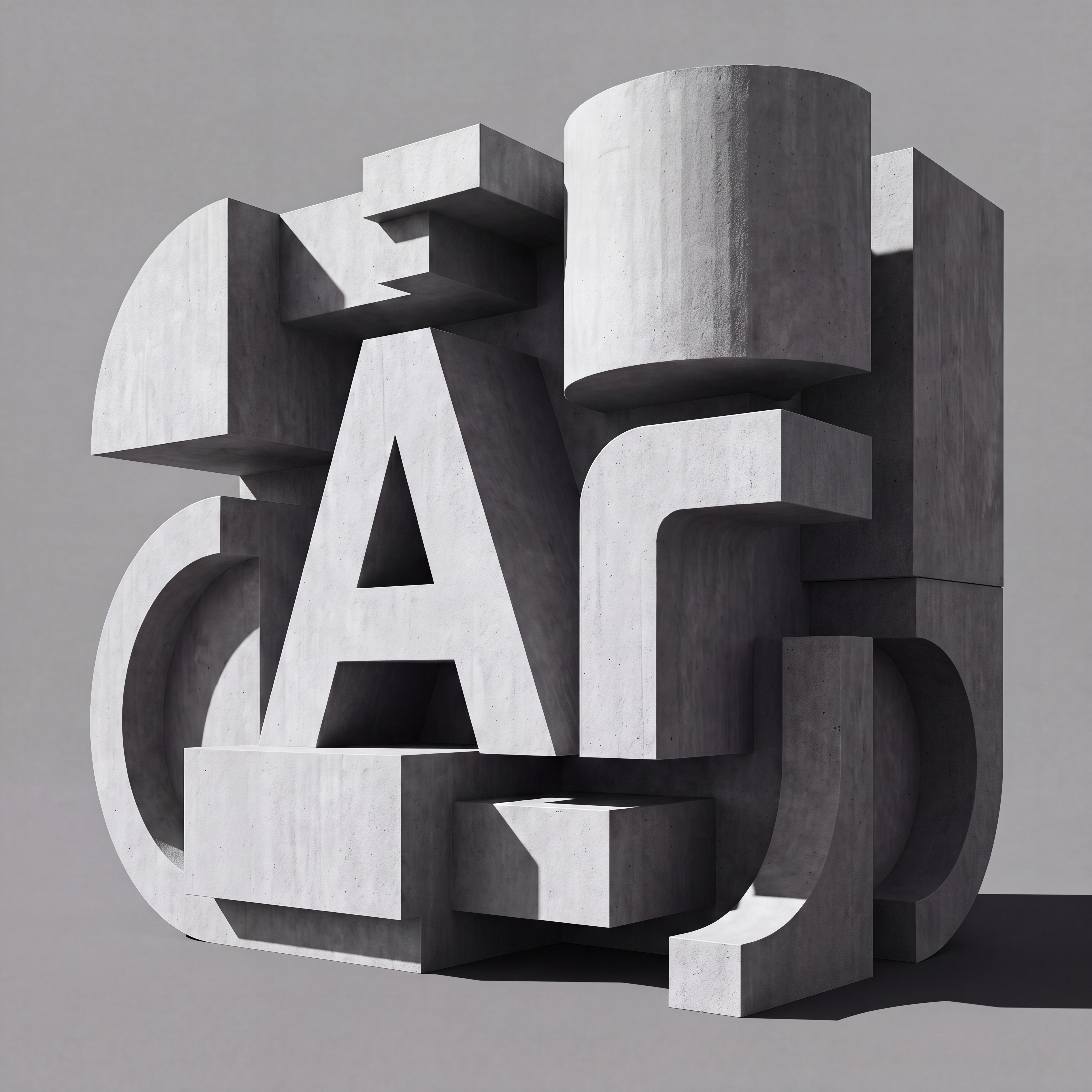


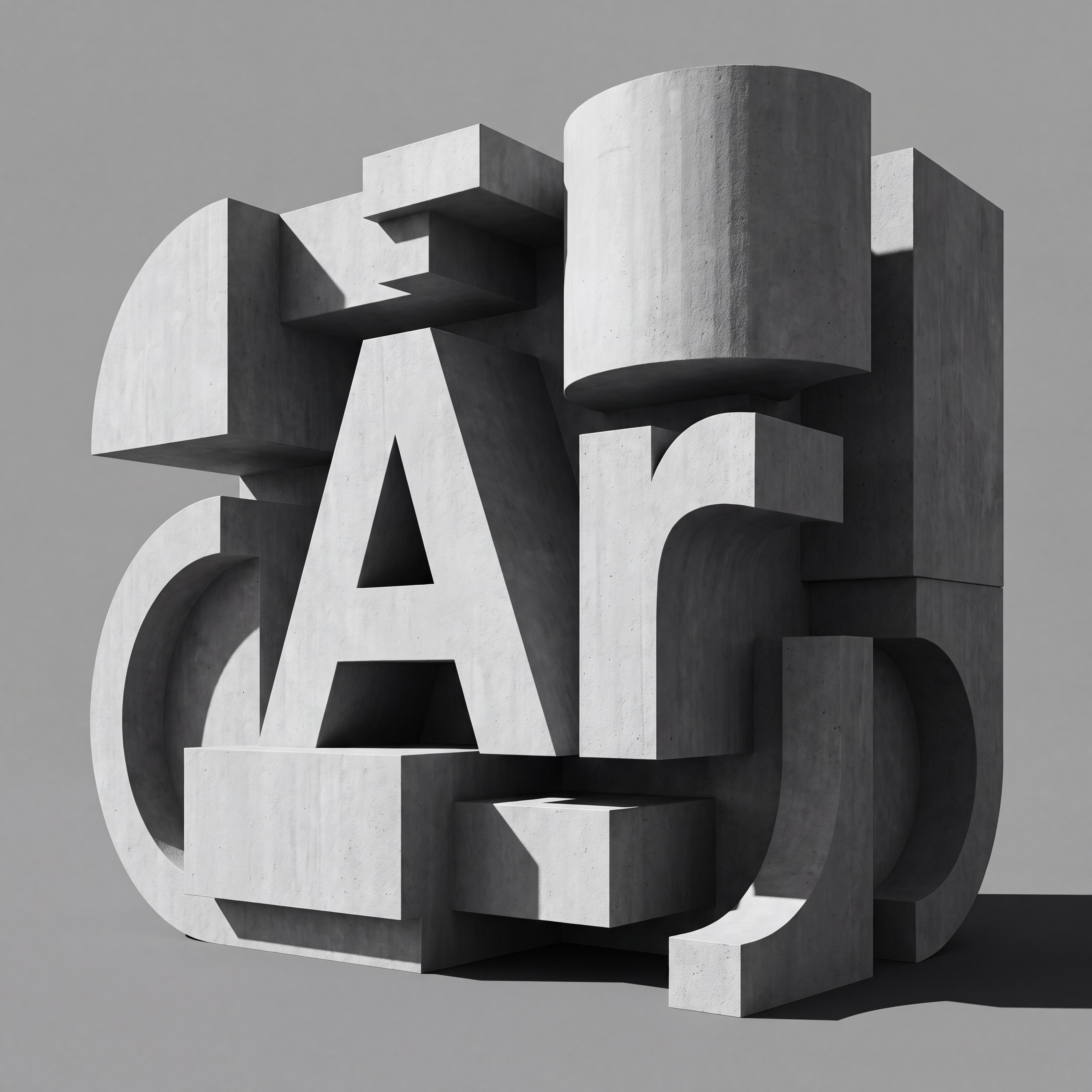

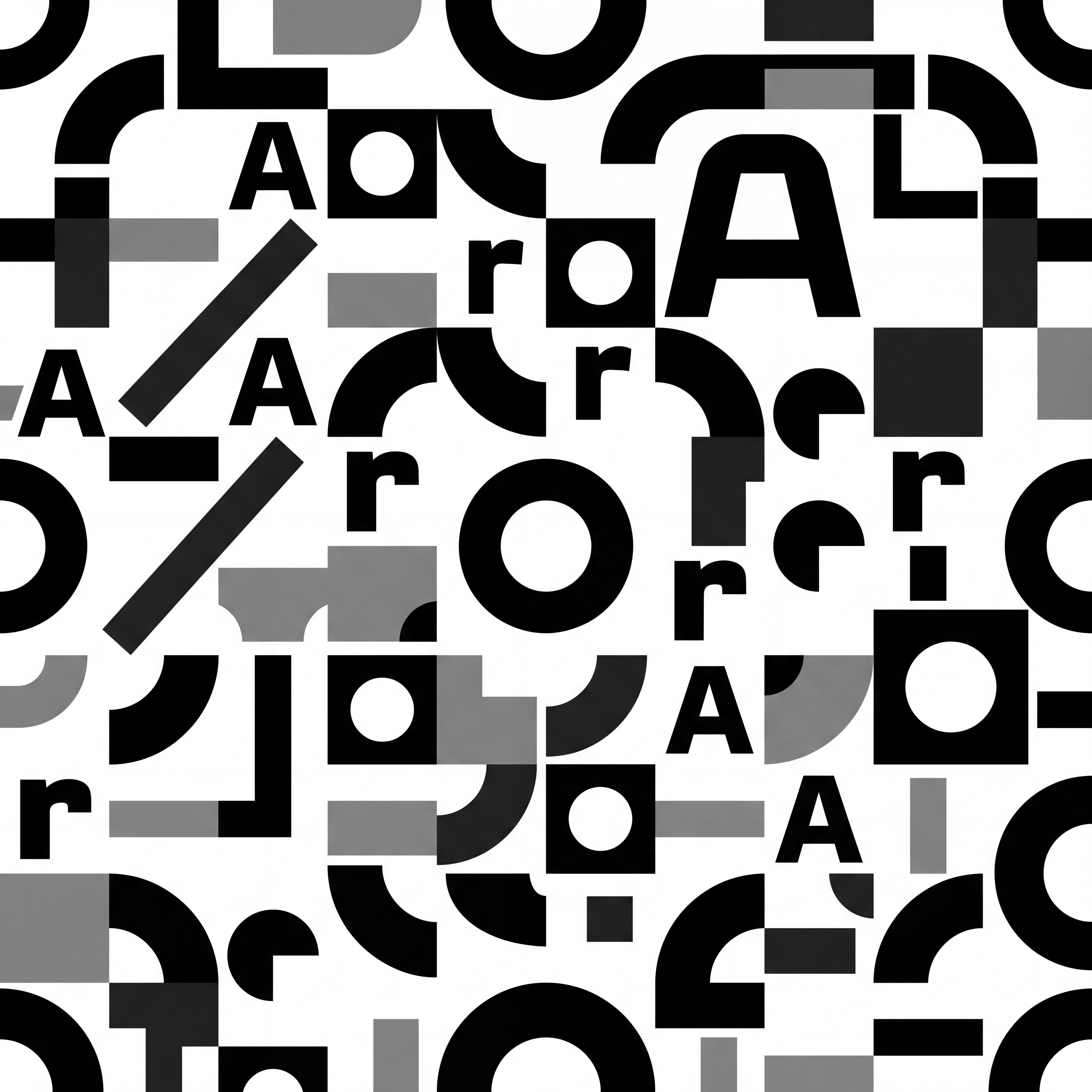
Keep the first image almost entirely unchanged — same sculpture, same composition, same concrete material, same lighting, same shadows, same camera angle, same background, same capital A. Fix only the lowercase r. The r in the current render is WRONG. It has a wide curved shoulder that arcs outward and downward, like a conventional grotesque. That is not the correct letterform. The correct r, shown in the second image, is built like this: a single heavy vertical stem, and a straight horizontal bar sitting at the top of that stem, extending to the right at a right angle. The two elements meet in a small, tight circular fillet in the corner where they join — nothing more. The horizontal bar is FLAT along its entire length: it does not curve, does not arc, does not droop, does not descend. It ends in a blunt, flat, vertical cut. There is no shoulder, no arch, no bracket, no flare. The bar is the same thickness as the stem — constant monolinear weight throughout. The overall silhouette is essentially a thick right angle — a vertical post with a flat horizontal shelf on top, softened only by one small compass-drawn corner radius. Rebuild the r with this exact geometry, extrude it to the same depth it currently has, and re-light it to match the existing scene exactly. Everything else in the image stays identical. Negative prompt: curved shoulder on r, arched r, drooping arm, descending arm, sloped bar, tapered terminal, bracketed joint, flared stroke, Helvetica r, grotesque shoulder, changed A, changed composition, changed lighting, changed material, changed camera
Free to start · Generate videos and images with AI in seconds