Image - 2026-08-24 11:40
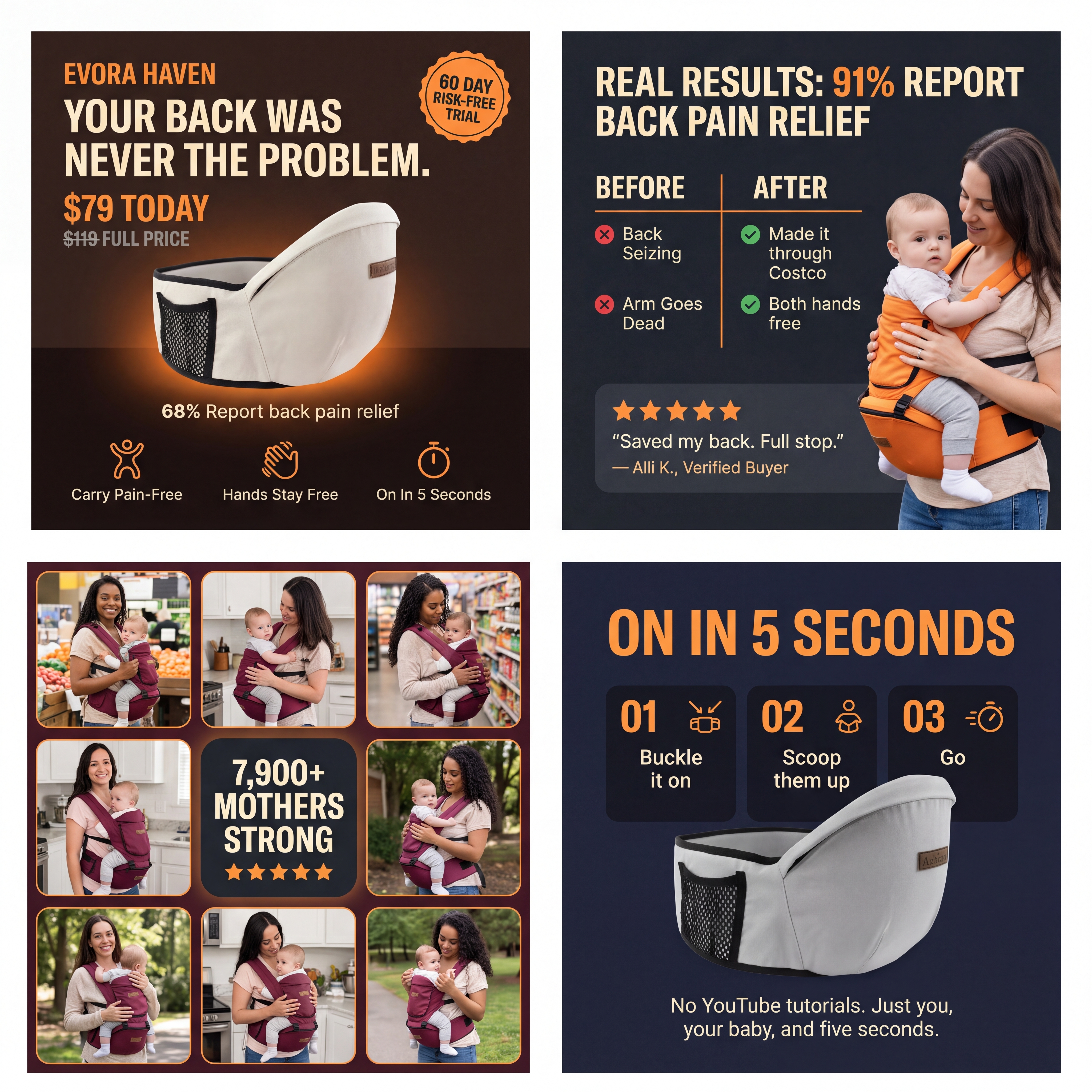
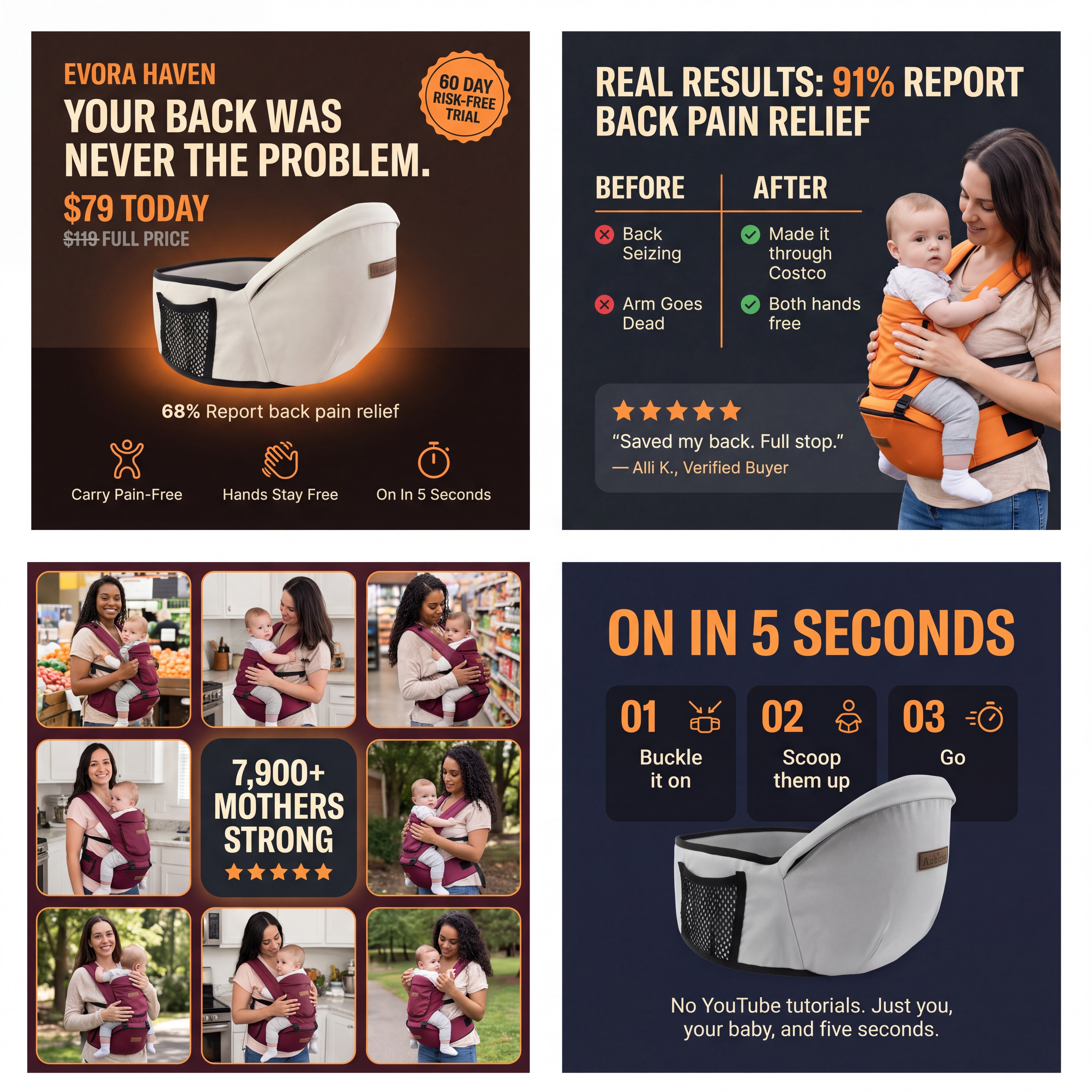
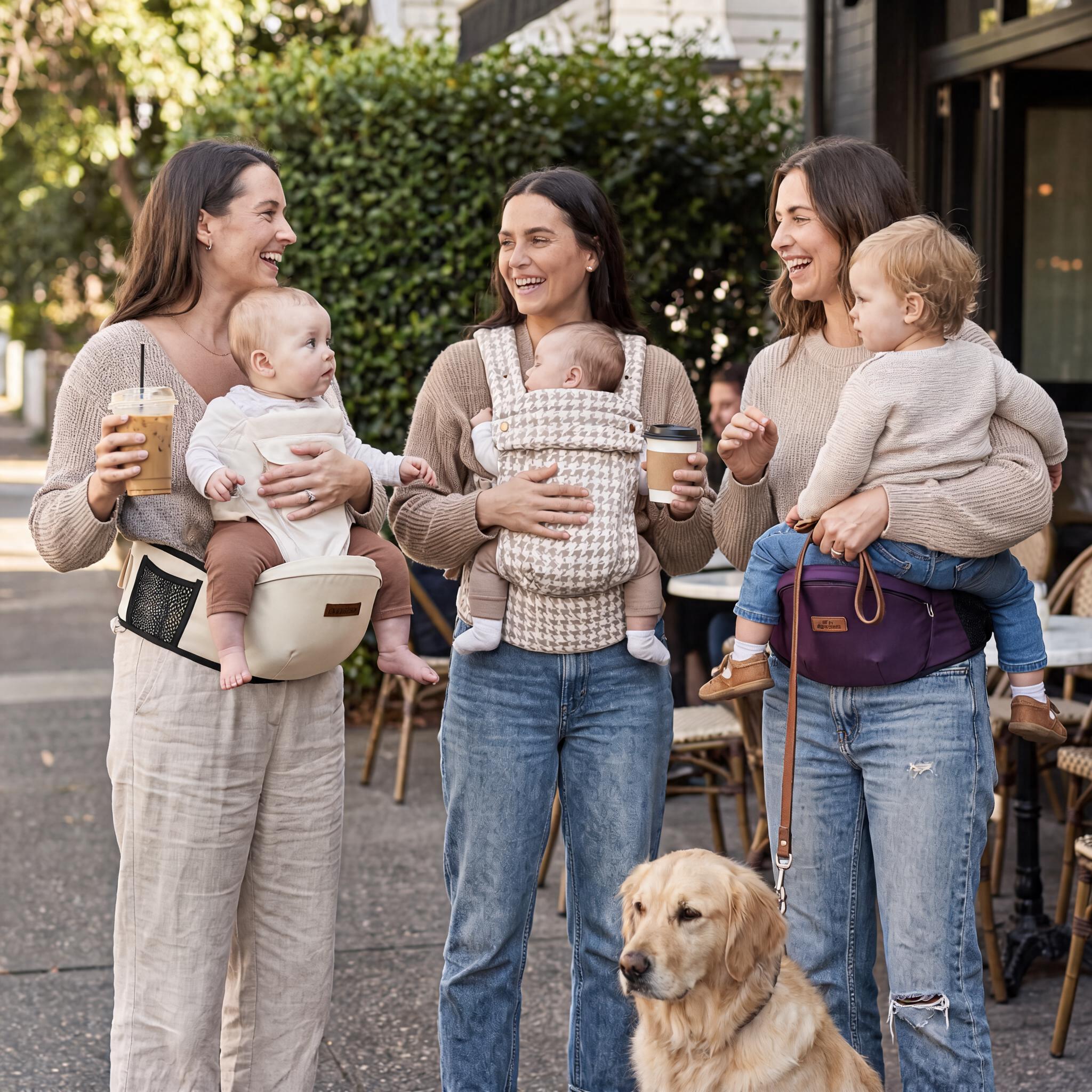
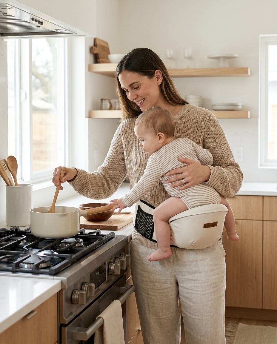
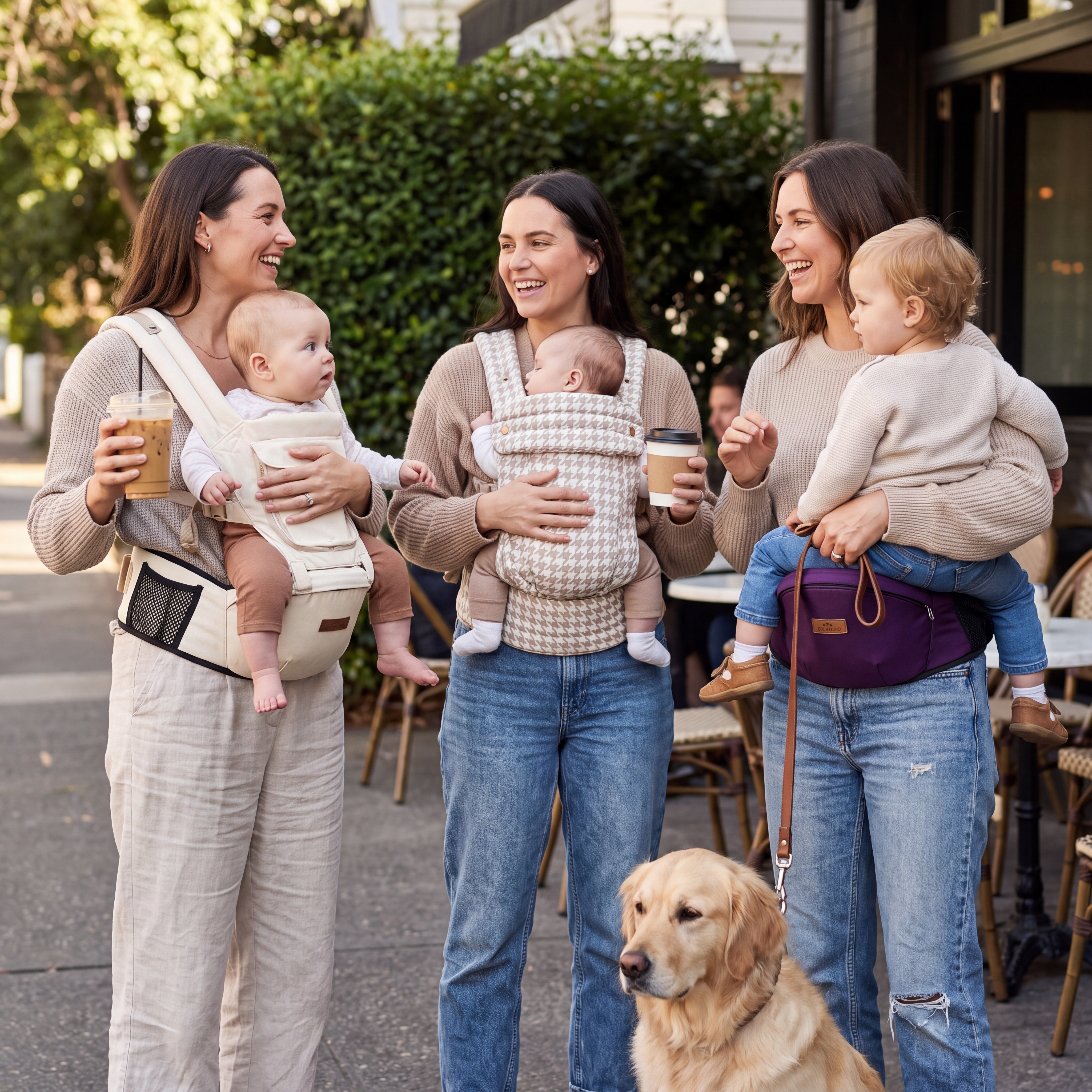
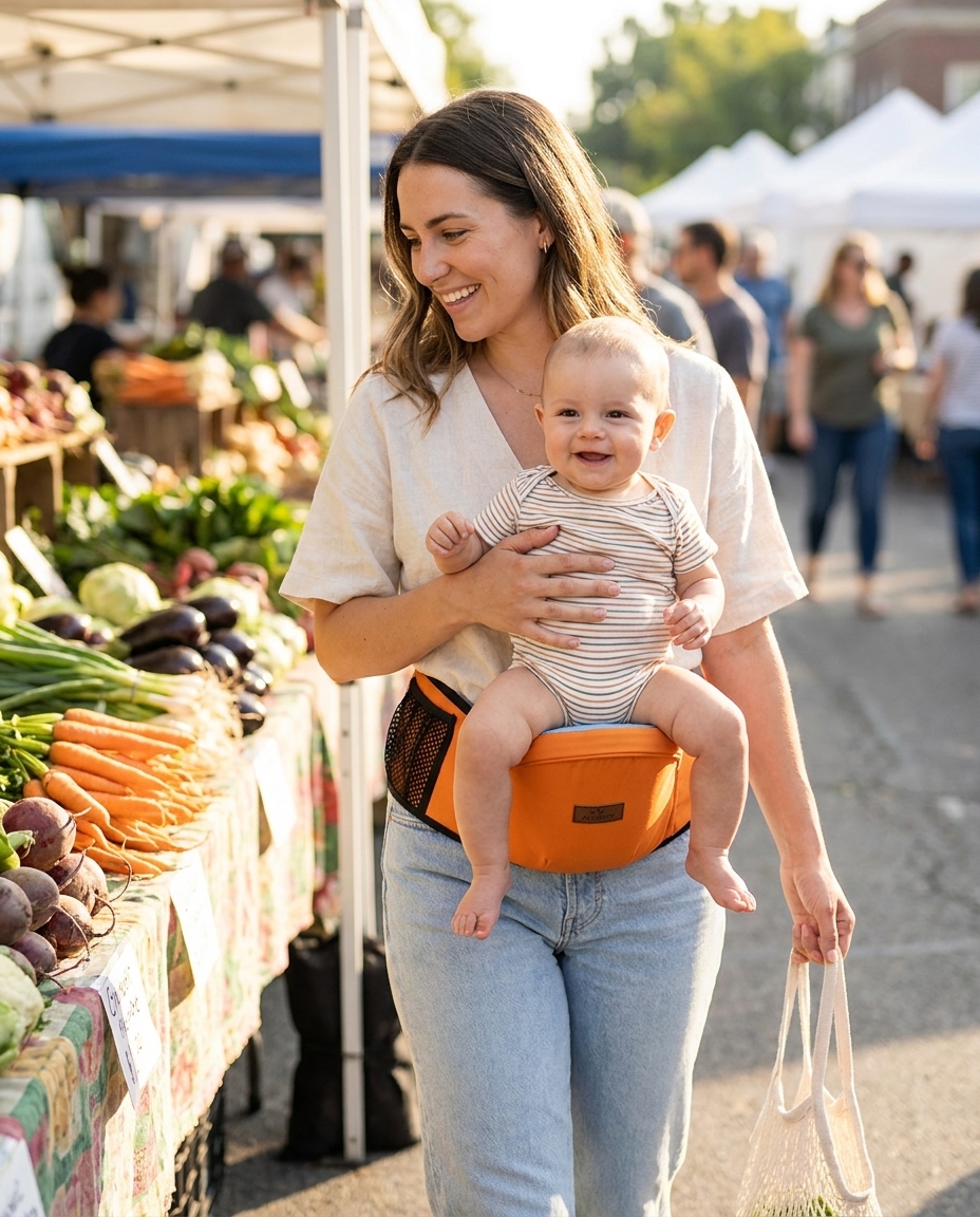
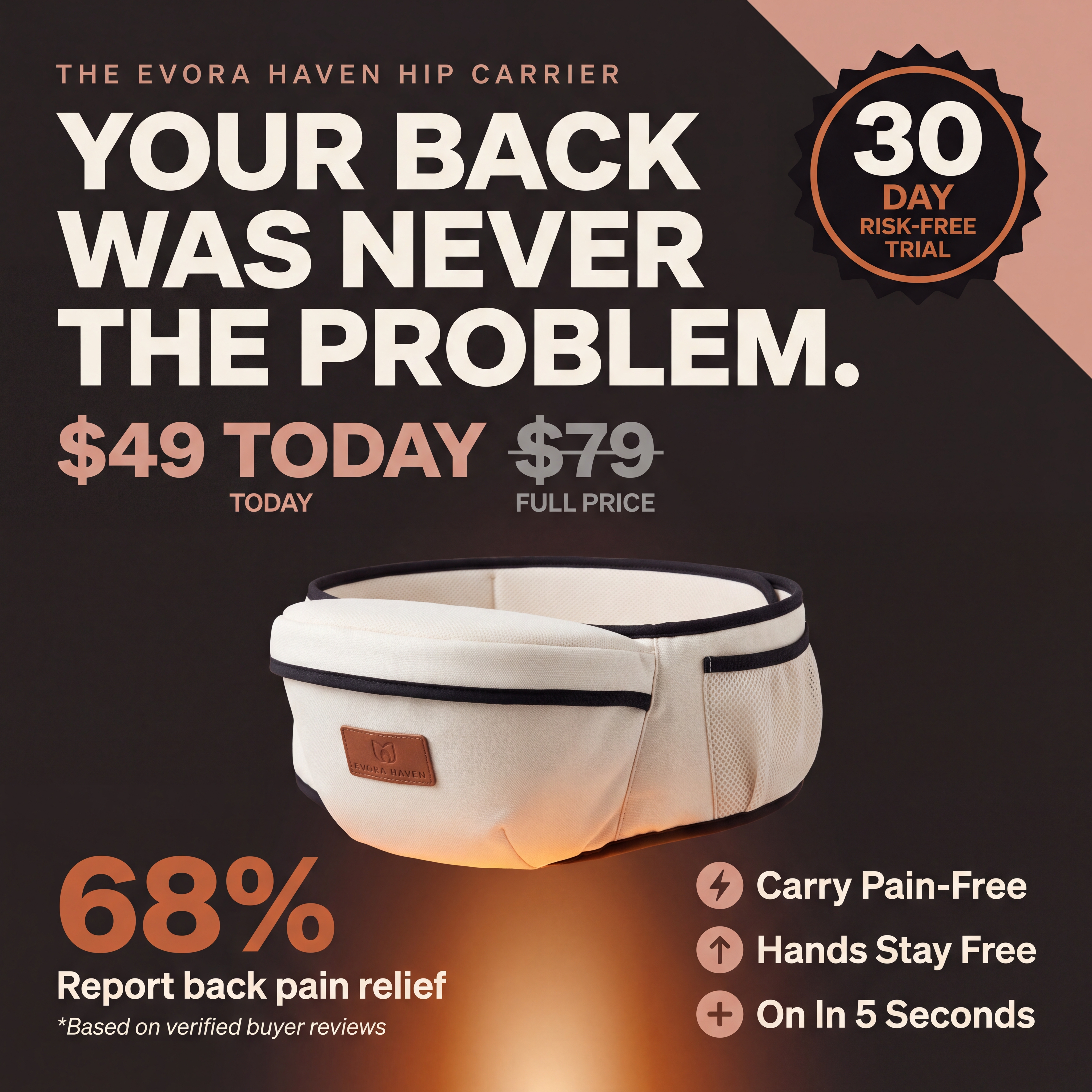
# Evora Haven — Mars Men-Style Product Image Prompts ## Modelled on the 3-image framework from Mars Men: Hero Offer / Real Results / Social Proof Grid ### All images are composite graphic designs (photo + copy overlay), not pure photography --- ## HOW THESE DIFFER FROM THE PREVIOUS PROMPT SET The previous prompts were for clean photography. These are **designed graphic images** — the kind you see on high-converting product pages and paid ads — combining a product or lifestyle photograph with bold overlaid copy, stats, icons, and layout elements. Tell Nano Banana Pro to treat each of these as a **graphic design composition**, not a photo. --- ## BASE PRODUCT DESCRIPTION (feed into every prompt) > Cream/off-white structured baby hip seat carrier. Wide padded waistband. > Firm raised seat platform. Black contrast trim edging. Mesh side pocket. > Small leather brand patch. The carrier should look identical in every image. --- --- # IMAGE SET 1: HERO OFFER IMAGE ## (Modelled on Mars Men Image 1 — price/offer/key benefits layout) --- ### HERO-01 — Main Offer Banner (Square 1:1, for product page + ads) **Prompt:** ``` Graphic design composition. Dark background split into two zones: top 35% is deep warm brown (#2C1810), bottom 65% is near-black (#0F0F0F). Warm orange-tinted spotlight light source from below centre illuminating the product from underneath. TOP SECTION — left side: - Small eyebrow text line: "THE EVORA HAVEN HIP CARRIER" in cream, uppercase, light tracking, small size - Large bold headline left-aligned in cream/white: "YOUR BACK" on line 1 "WAS NEVER" on line 2 "THE PROBLEM." on line 3 Heavy sans-serif font. Very large — dominant in the frame. - Below headline: sale price in large blush/terracotta orange: "$79 TODAY" with a strikethrough price in grey next to it: "$119 FULL PRICE" Labels beneath each: "TODAY" and "FULL PRICE" in small uppercase cream text. TOP SECTION — right side: - Circular badge (black with orange border, starburst/seal shape): Inside: "60" in very large bold white text Below: "DAY" in small orange text Below: "RISK-FREE" in small white text Below: "TRIAL" in small orange text The badge should look like a premium quality seal, slightly tilted 5 degrees. CENTRE — product hero: - The cream hip seat carrier product shot placed centre-bottom, emerging from below the frame slightly, dramatically lit from below with warm orange/amber light making it glow. The seat platform faces the viewer. The product floats slightly above the bottom edge. BOTTOM LEFT of product: - Bold orange percentage stat: "68%" in very large heavy font - Below in white: "Report back pain relief" - Below in small cream italic: "*Based on verified buyer reviews" BOTTOM RIGHT of product (three benefit lines with icons): - ⚡ "Carry Pain-Free" (cream text, bold, medium size) - ↑ "Hands Stay Free" (cream text, bold, medium size) - + "On In 5 Seconds" (cream text, bold, medium size) Each line has a small blush/orange icon to the left. Overall style: premium supplement-brand aesthetic adapted for baby gear. Dark, dramatic, high-contrast. Not pastel. Not "mum aesthetic." Confident, bold, results-focused. ``` --- ### HERO-02 — Offer Banner (Portrait 4:5, for Instagram feed + Shopify PDP) **Prompt:** ``` Graphic design composition, portrait 4:5 format. Same dark background as HERO-01 (deep brown top zone, near-black bottom zone). TOP THIRD: - Eyebrow: "EVORA HAVEN" small uppercase cream - Headline stacked vertically, large heavy cream/white sans-serif: Line 1: "THE BACK PAIN" Line 2: "WAS NEVER" Line 3 (in blush/terracotta italic serif): "your fault." The contrast between bold sans-serif and italic serif on line 3 creates typographic tension. - Below headline: two prices side by side: "$79" in large blush orange / "$119" struck through in grey Small labels: "TODAY" / "WAS" CENTRE THIRD: - The cream hip seat carrier, dramatically lit from below with warm amber spotlight, centred in the frame. Large. Dominant. - Floating to the left of the product: a stat callout box (dark rounded rectangle with blush orange border): "84%" in large bold orange "of new moms experience" in small white "back pain monthly" in small white Source: small italic cream "BMC Musculoskeletal Disorders 2024" BOTTOM THIRD — three horizontal benefit rows with dividers: Each row: [icon] [benefit headline] [short descriptor] Row 1: ◆ NO LEVER EFFECT — Weight sits at your pelvis, not your spine Row 2: ◆ ON IN 5 SECONDS — One buckle. No YouTube. No second hands. Row 3: ◆ 60-DAY TRIAL — If it ends up in your closet, full refund. Text in cream/white on dark background. Blush orange accents on icons and dividers. Overall: bold, confident, high-converting product page aesthetic. ``` --- --- # IMAGE SET 2: REAL RESULTS IMAGE ## (Modelled on Mars Men Image 2 — stat circles + authority quote) --- ### RESULTS-01 — Real Results Graphic (Square 1:1) **Prompt:** ``` Graphic design composition. Dark charcoal/near-black textured background (subtle grain texture, not flat). Layout inspired by clinical results infographics. TOP SECTION: - Headline left-aligned: "REAL" in large bold blush/terracotta orange heavy sans-serif "RESULTS" in large bold white heavy sans-serif — on the same line Below: small cream italic text "*Based on a survey of 1,000+ Evora Haven mothers" MIDDLE SECTION — three circular stat gauges, evenly spaced horizontally: Each circle: dark background, blush/terracotta orange arc (partial ring, approximately 200–250 degrees filled) indicating the percentage level. Circle 1: - "91%" in large bold white inside the ring - Below the circle: "Reported relief from" in white "back & shoulder pain" in blush orange "with Evora Haven." in white (small text) Circle 2: - "78%" in large bold white inside the ring - Below: "Said carrying felt" in white "easier within 1 week" in blush orange "of use." in white Circle 3: - "94%" in large bold white inside the ring - Below: "Would recommend" in white "to another mother" in blush orange "in pain." in white BOTTOM SECTION — authority quote card: White rounded rectangle card sitting on the dark background. Left side of card: a lifestyle photo of a woman (approximately 35–40, professional, physiotherapist or wellness expert appearance, warm confident expression) emerging slightly outside the card border on the left. Right side of card (inside the white area): - Five filled star icons in blush orange - Quote in dark navy/midnight text, medium size, serif italic font: "The hip seat position is exactly what the body needs — weight at the pelvis, posture maintained, hands free. I recommend this to every mother I see with carrying-related pain." - Name in blush orange bold uppercase sans-serif: "DR. SARAH M." - Title in small dark grey uppercase: "WOMEN'S HEALTH PHYSIOTHERAPIST" Overall: premium health-brand aesthetic. Dark, data-driven, trustworthy. Orange and white accent colours on dark charcoal background. ``` --- ### RESULTS-02 — Before/After Results (Portrait 4:5) **Prompt:** ``` Graphic design composition, portrait 4:5 format. Dark charcoal background. TOP: - Headline centred: "WHAT CHANGES" in bold white heavy uppercase sans-serif "IN THE FIRST WEEK." in bold blush orange heavy uppercase sans-serif Below: small cream text "Real results from verified Evora Haven buyers" UPPER MIDDLE — two side-by-side comparison columns with a thin blush orange vertical divider between them: LEFT COLUMN — labelled "BEFORE" in small uppercase red/muted text: Stack of pain points, each with a red X icon: ✗ Back seizing by 10am ✗ Arm goes dead in 6 minutes ✗ Counting down until you can put them down ✗ Another carrier. Another closet. ✗ Guilt when your body gives out before they do RIGHT COLUMN — labelled "AFTER" in small uppercase green/sage text: Stack of wins, each with a cream check icon: ✓ Made it through Costco. Back didn't say a word. ✓ Both hands free. Dinner on the stove. ✓ Forgot to track the countdown. Because there wasn't one. ✓ One buckle. Under 5 seconds. ✓ You chose to put them down. Not your body. LOWER MIDDLE — large pull stat centred: "68%" in very large blush orange bold display font Below: "of 5-star reviews specifically mention pain relief" in cream Below: small italic "(back, arm, wrist, or shoulder)" in warm grey BOTTOM — two testimonial mini-cards side by side (cream/off-white background): Card 1: Stars: ★★★★★ in blush orange "Saved my back. Full stop." in bold dark serif "— Alli K., Verified Buyer" in small warm grey Tag: "Back Pain" in small blush pill/badge Card 2: Stars: ★★★★★ in blush orange "Life changing. Mom of 2 under 2." in bold dark serif "— Jessica M., Verified Buyer" in small warm grey Tag: "Mom of 2" in small blush pill/badge ``` --- ### RESULTS-03 — Physics Proof Graphic (Square 1:1, for educational/trust content) **Prompt:** ``` Graphic design composition. Clean dark navy/midnight background. Scientific/educational aesthetic — think medical infographic meets premium brand design. TOP: - Small eyebrow: "THE GRAVITY TRAP" in blush orange uppercase small tracking - Headline: "WHY YOUR BACK HURTS" in large bold white "(And why it's not your fault)" in medium blush italic serif below CENTRE — three horizontal rows, each showing a carrying scenario: Row 1 — dark card with subtle left red border: Left: simple line-art silhouette of a woman holding baby in arms away from body Centre stat: "60 LBS" in very large bold red/dark orange Small label below: "felt load on your spine" Right text: "Arms only — maximum lever effect. A 20lb baby held away from your body creates 3x the force on your spine." Baby weight label: "20 LB BABY" in small cream Row 2 — dark card with subtle amber border: Left: silhouette of woman with front-structured carrier Centre stat: "40 LBS" in large bold amber/yellow Small label: "felt load on your spine" Right text: "Front carrier — weight pushed forward from your centre of gravity. Your spine compensates. Every single time." Baby weight label: "20 LB BABY" in small cream Row 3 — dark card with GLOWING blush/sage green border (this is the WIN): Left: silhouette of woman wearing hip seat carrier, upright posture Centre stat: "20 LBS" in large bold sage green Small label: "felt load — weight at your pelvis" Right text: "Evora Haven hip carry — baby weight sits at your pelvis. Zero lever effect. Your body finally works WITH the weight." Baby weight label: "20 LB BABY" in small cream LABEL overlaid on this row: "EVORA HAVEN" in small blush orange pill badge BOTTOM: Centred blush button/CTA element (decorative, not clickable): "TRY IT RISK-FREE FOR 60 DAYS →" Below: small cream text "Full refund if it doesn't change everything." Overall: dark, premium, educational. Feels like it belongs in a high-end wellness brand deck, not a typical baby product page. ``` --- --- # IMAGE SET 3: SOCIAL PROOF GRID ## (Modelled on Mars Men Image 3 — UGC mosaic with central stat overlay) --- ### PROOF-01 — "Mothers Strong" UGC Grid (Square 1:1) **Prompt:** ``` Graphic design composition. A mosaic/grid of 8 UGC-style lifestyle photographs arranged around a central text overlay block. BACKGROUND & GRID STRUCTURE: 8 photo panels arranged in a 3x3 grid with the centre panel replaced by the overlay text block. Each photo has a thin black border/gap between them (2–3px). The overall grid fills the entire square frame edge to edge. THE 8 PHOTO PANELS (each approximately 33% of image width): Each should feel like a real candid customer photo — slightly imperfect, natural lighting, shot on a phone. Different locations, different mothers. All wearing the cream Evora Haven hip seat carrier with a baby on the seat. Panel 1 (top-left): Black mother, approximately 28, at a farmers market. Baby approximately 9 months on hip seat. Browsing a vegetable stall. Candid smile. Warm morning light. Panel 2 (top-centre): Latina mother, approximately 31, in a kitchen, one hand stirring a pot, baby 10 months on carrier. Looking down at baby. Warm indoor light. Panel 3 (top-right): East Asian mother, approximately 29, at a Costco or warehouse store, pushing a cart. Baby 12 months on carrier. Mid-stride. Store lighting. Panel 4 (middle-left): Caucasian father, approximately 33, wearing the carrier with a baby 8 months. Standing in a park, looking slightly proud and surprised it's working. Candid. Panel 5 (middle-right): South Asian mother, approximately 34, at an airport, rolling carry-on behind her, baby 11 months on carrier. Both hands free. Terminal background. Panel 6 (bottom-left): Caucasian grandmother, approximately 58, wearing the carrier with a toddler approximately 18 months. In a garden. Smiling at the toddler. Panel 7 (bottom-centre): Multiracial mother, approximately 27, sitting on outdoor steps, looking down at baby 7 months on the carrier with genuine warmth. Close, intimate shot. Panel 8 (bottom-right): Black mother, approximately 30, walking on a city sidewalk, both hands holding shopping bags, baby 9 months on carrier. Confident stride. CENTRE PANEL (replacing the middle photo): Dark rounded rectangle (near-black, subtle shadow) with text: - "7,900+" in very large bold white heavy sans-serif - "MOTHERS STRONG" in medium bold blush/terracotta orange uppercase - Below: small cream text "and counting" - Five star icons in blush orange below the text OVERALL AESTHETIC: The grid should feel like a real brand's UGC wall — organic, diverse, real. The photos look like they were submitted by customers, not shot by a photographer. The centre stat block is the only designed element. High energy. Warm. Community-feeling. ``` --- ### PROOF-02 — Review Wall with Pain Relief Focus (Portrait 4:5) **Prompt:** ``` Graphic design composition, portrait 4:5. Dark near-black background. TOP SECTION: - Headline: "WHAT THEY'RE SAYING." in large bold white uppercase heavy sans-serif - Subline: "7,900+ verified reviews · 4.8 stars" in medium blush orange - Five large filled star icons in blush orange UPPER MIDDLE — One large featured review card: Off-white/cream card with rounded corners, slight drop shadow. Inside: - "★★★★★" in small blush orange stars - Review headline in dark serif bold: "Life Changing. Mom of 2 Under 2." - Review body in dark navy body text (15–16px equivalent): "Oh my gosh. This is the absolute best thing I could have acquired as a mother of 2 under 2. This product has completely saved my back. I plan on making a reel because I need everyone to know." - Reviewer name in small blush uppercase: "JESSICA M. — VERIFIED BUYER" - Tag pill in sage green: "Mom of 2 Under 2" - Small lifestyle photo thumbnail (circular, 50px) of a woman, left-aligned beside the name — casual, real, authentic-feeling. LOWER MIDDLE — three mini review cards in a row (smaller, horizontal): Each card: cream background, rounded, compact Mini card 1: ★★★★★ (blush) | "Saved my back. Full stop." "Alli K. · Verified Buyer" · Tag: "Back Pain" Mini card 2: ★★★★★ (blush) | "Game changer. Mom of 4." "Lara S. · Verified Buyer" · Tag: "Heavy Baby" Mini card 3: ★★★★★ (blush) | "Hours without issue." "Gabrielle L. · Verified Buyer" · Tag: "Chronic Pain" BOTTOM SECTION — two horizontal stat bars: Stat bar 1: Label: "Report back pain relief" in white Orange progress bar: 68% filled "68%" in bold blush orange on the right Stat bar 2: Label: "Would recommend to another mom" in white Orange progress bar: 94% filled "94%" in bold blush orange on the right Below stats: Small italic cream text: "*Based on analysis of 7,900+ verified buyer reviews" OVERALL: Dark, premium, data-rich. Feels like evidence, not advertising. ``` --- ### PROOF-03 — "She Wished She Found It Sooner" Emotional Proof (Square 1:1) **Prompt:** ``` Graphic design composition. Split layout. Left half: lifestyle photo. Right half: dark navy/midnight background with typographic copy. LEFT HALF — lifestyle photo panel: A lifestyle photograph (candid, warm, emotional) of a mother, approximately 30, carrying her baby (approximately 10 months) on the cream Evora Haven hip seat carrier. She is in a warm-lit home environment — perhaps a kitchen or living room with window light. She is not looking at the camera. She is looking at her baby with a genuinely tender expression. The baby is looking up at her. The cream carrier is clearly visible. The image should feel like a real moment, not a campaign. Natural morning light. Warm tones. RIGHT HALF — dark background with copy: Top: blush orange quotation mark (large, decorative, serif) Main quote in large white serif italic font: "Wished I'd found this sooner." (Each phrase on its own line. Large. Dominant.) Below quote: thin blush orange horizontal rule Below rule — stacked testimonial attribution lines: - Five ★ in blush orange (small) - "— Sarah B., Verified Buyer" in small cream uppercase - "After 4 months of back pain." in small warm grey italic Below attribution — three micro-stats stacked vertically: Each in a small dark card with blush left border: Card 1: "4 months" label in warm grey / "Average pain before finding us" in cream small Card 2: "Week 1" label in blush / "When most buyers first notice relief" in cream small Card 3: "60 days" label in sage / "To try it completely risk-free" in cream small Bottom right corner: Evora Haven logo/wordmark in small cream serif OVERALL: Emotionally resonant. The left photo provides feeling. The right side provides proof. Together they answer the question: "Does it actually work?" with a human answer, not just a data answer. ``` --- --- # IMAGE SET 4: USP / FEATURE IMAGES ## (Unique selling point callouts — one benefit per image, icon + stat + short copy) --- ### USP-01 — The Physics Argument (Square 1:1, bold graphic) **Prompt:** ``` Bold graphic design image. Midnight/near-black background. LARGE centred display text: Line 1: "YOUR 20LB BABY" in cream/white heavy sans-serif (large) Line 2: "DOESN'T FEEL LIKE" in cream/white heavy sans-serif (large) Line 3: "20 POUNDS." in cream/white heavy sans-serif (large) [Single thin blush orange horizontal rule] Line 4: "Until now." in large blush italic serif (contrasting font) Below the rule — a simple horizontal diagram: Three icons in a row, each with a label below: Icon 1 (left): Simple line art of a person holding baby in arms Label: "ARMS ONLY" in small cream uppercase Stat below: "60 LBS" in bold red/muted orange Small label: "felt load" Icon 2 (centre, slightly larger): Simple line art of person with front carrier Label: "FRONT CARRIER" in small cream uppercase Stat: "40 LBS" in bold amber Small label: "felt load" Icon 3 (right, highlighted with blush border glow): Simple line art of person with hip seat carrier, upright posture Label: "EVORA HAVEN" in small blush orange uppercase Stat: "20 LBS" in bold sage green Small label: "felt load" Bottom of image: Small cream text: "The hip carry position places baby at your pelvis — your body's strongest load-bearing structure. Zero lever effect." ``` --- ### USP-02 — Five Pockets / Replaces the Diaper Bag (Square 1:1) **Prompt:** ``` Clean dark graphic composition. Deep navy background. Top: eyebrow in blush orange uppercase small: "5 STORAGE POCKETS" Centre: Large overhead flat lay photograph of the cream Evora Haven carrier with five everyday objects placed at or near each pocket, each connected to its pocket by a thin blush orange dotted line with a small label. Objects: 1. Smartphone → "Phone pocket" label 2. Baby wipes packet → "Wipes pocket" label 3. Snack bar → "Snack pocket" label 4. Small water bottle in mesh side pocket → "Bottle holder" label 5. Keys/pacifier → "Zip pocket" label Below the flat lay photo, large display copy: "Replaces your" in medium cream serif italic "diaper bag." in large bold blush orange heavy sans-serif Below: small cream body text: "Five pockets. Phone, wipes, snacks, keys, bottle. Everything you need. Nothing you don't." Bottom stat: "Reviewed by 7,900+ mothers · 4.8 ★" in small blush text ``` --- ### USP-03 — 60 Day Risk-Free (Square 1:1, guarantee image) **Prompt:** ``` Dark charcoal/near-black background. Centre: large circular badge element. The badge: - Outer ring: blush/terracotta orange, thick (seal-style) - Inner ring: thin cream/off-white, slightly smaller - Badge background: deep midnight navy - Radiating starburst lines around outer ring in dark orange (subtle) Inside the badge, top to bottom: - Small uppercase cream text: "EVORA HAVEN" - Large bold white number: "60" - Medium uppercase cream: "DAY" - Thin blush divider line - Medium bold white: "RISK-FREE" - Medium blush: "TRIAL" Below the badge (outside the circle): Headline in large bold white sans-serif: "Try it for 60 days. Your back will know by week two." Below headline, four bullet points in cream (small, with blush check icons): ✓ Full refund if it doesn't work — no questions asked ✓ Free return shipping included ✓ No forms, no friction, no awkward conversations ✓ FSA/HSA eligible — use pre-tax health dollars Bottom of image: Small italic cream: "We offer 60 days because we know what happens in them." Overall: Bold, confident, trust-building. The badge is the visual anchor. Dark and premium, not light and fluffy. ``` --- ### USP-04 — "5 Seconds" Ease of Use (Square 1:1) **Prompt:** ``` Dark background graphic. High-contrast, minimalist. Top of image: Large bold display text, centred: "ON IN" in large heavy cream sans-serif "5" in enormous blush orange display number (takes up ~40% of image height) "SECONDS." in large heavy cream sans-serif Below the large number, thin blush orange divider Below divider — three-step row: Three dark cards side by side, each with a number and description: Card 1: "01" in blush orange bold Icon: belt/buckle outline "Buckle it on." in white medium Card 2: "02" in blush orange bold Icon: arms/scoop outline "Scoop them up." in white medium Card 3: "03" in blush orange bold Icon: walking figure with baby "Go." in white medium Below the cards: Small cream text: "No YouTube tutorials. No second person. No threading fabric through seventeen rings. Just you, your baby, and five seconds." Bottom: Quote in blush italic serif: "'Just set them down and scoop them back up again.' — Real Evora Haven mother" ``` --- ## COPY NOTES FOR ALL IMAGES These copy lines are drawn directly from the avatar research and should be used verbatim in the appropriate prompts above. **Highest-resonance copy lines for this avatar:** - "Your back was never the problem." - "Carry them as long as they need." - "The countdown in your head? It stops." - "Love shouldn't cost you your body." - "Wished I'd found this sooner." (most common review phrase) - "Both hands free. Dinner on the stove." (Costco/daily life use case) - "You don't have to choose between your back and your baby." - "68% of 5-star reviews mention pain relief specifically." - "On in 5 seconds. No tutorial. No second person." - "60 days to find out if it changes everything." **Copy lines to AVOID (wrong register for this avatar):** - "Perfect for busy moms!" (too chirpy, she's exhausted not bubbly) - "Stylish AND practical!" (undersells the pain angle) - "Snuggle your little one!" (feels like it's selling closeness she already has) - "The perfect gift for new moms!" (gift framing = not urgent for her) - Any language implying she needs to be convinced to hold her baby --- ## PRODUCTION ORDER RECOMMENDATION Generate in this order so each image can reference previous outputs: 1. HERO-01 (establishes product look and brand colour palette) 2. RESULTS-03 (physics proof — core argument visual) 3. PROOF-03 (emotional left/right split — highest emotional resonance) 4. PROOF-01 (UGC grid — needs diverse lifestyle shots) 5. RESULTS-01 (stat circles + expert quote) 6. USP-03 (guarantee badge — high-converting standalone) 7. HERO-02 (portrait version of hero for mobile) 8. USP-01, USP-02, USP-04 (feature-specific) 9. RESULTS-02, PROOF-02 (review wall and before/after) all babies should be facing towards the mother in the carriers, include the colour variants of the carrier
Free to start · Generate videos and images with AI in seconds
More from this creator
More L images
См. все →